I love my Bella Solids Color Chart.
When I needed to decide on a solid to coordinate with
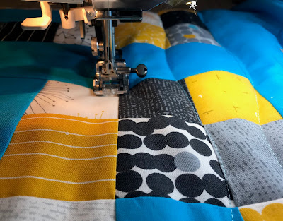
my Fragile by Zen Chic Mini Charm Project,
I reached for my color chart.
I find this an essential tool when designing and deciding
on colors and fabrics.
There are touches of a lovely blue turquoise in the
fabric line.
I was looking for a solid to bring out this color,
so I opened to the blues and turquoise page
on my handy Bella Solids Color Chart
and looked for the perfect match.
There were several possibilites,
Surf, Capri, Bright Turquoise,
and even Pastel Blue if I wanted to tone it down.
My son the engineer was walking by so I asked him which color he liked best.
He looked them over and pointed out the Bright Turquoise has the same color intensity
of the golden yellow in the Fragile line.
My Matty has a great eye for design and color.
I agreed.
So Bright Turquoise it is!
I am loving sewing with these fabrics!
I am looking forward to showing off this project,
but it shall have to wait.
This is for another great
Maestro, the ever present quilty kitty helper,
says she is on guard to make sure there is no more peeking.
:) Soon! :)
How do you decide what solids to use in a new project?
Do you use a color chart?
I am always interested in sharing quilting tips.
:-)


